Background
Ryde had an idea and raised money before it had a brand. That is a stranger place to start than it sounds: the funding says somebody believes in the product, and nothing yet says what the company is.
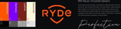
Branding-wise there was a name, a logo, that was it. The founders had an brief idea what Ryde should feel like, look like, what it should stand for. We needed to sort that out for anyone to believe that this four-person company had made a better stirrup than the ones that had existed for a century.
Creative team
| Andreas Carlsson | Design, development, photography, film |
| Sanna-Marie | Inventor |
| Karin Falkemo | CEO |
| Patrik Lindberg | Constructor, industrial design |
| Jennifer Norén | Communication and marketing |
| Nicke Bergström | Naming, logotype |
| Henrik Berglöf | Copy |
The problem
Equestrian used to be fashion
Equestrian brands are arranged.
Look at the category and it is all the same: polished imagery of perfectly dressed rider, horses groomed to a shine, white breeches against a clean arena, everything styled to within an inch of its life. Closer to a fashion than to the sport equestrian really is.
Riding is a five-in-the-morning alarm, mud, rain, cold, hard work, heavy lifting, a horse that does not want to load, but also the friendship that makes people love it. That whole side of the sport, the part everyone in it actually recognises, was missing from every brand competing with Ryde.
The reference we kept coming back to was Chrysler's Imported from Detroit. Grainy, rough, unglamorous, and unmistakably about graft. If that emotion could be brought into a category this polished, Ryde would not look like a smaller version of its competitors. It would look like a totally different beeing.
Where it started
A brand for the heart, and the mind.
The branding project started with seven design days on Gotland.
Everyone involved went to Gotland in late October and stayed at a tiny closed down hotel, with founders, riders, copywriters, designers and scientists there for the week.
The week has its own write-up in my “Behind the Case” post here →
The brief put a number on the split before any of the work began. Twenty percent of the communication should explain the logic and how the stirrup is set up, and the remaining eighty should take the customer out into the forest at sunset, birdsong, jumping fences.
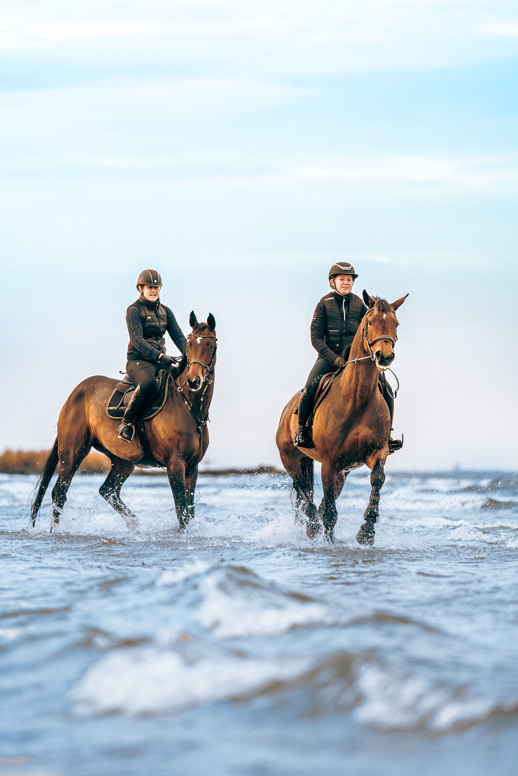
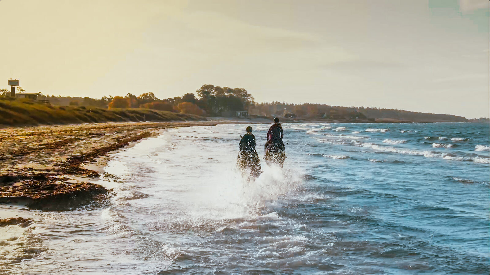
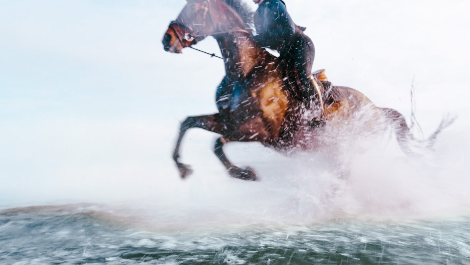
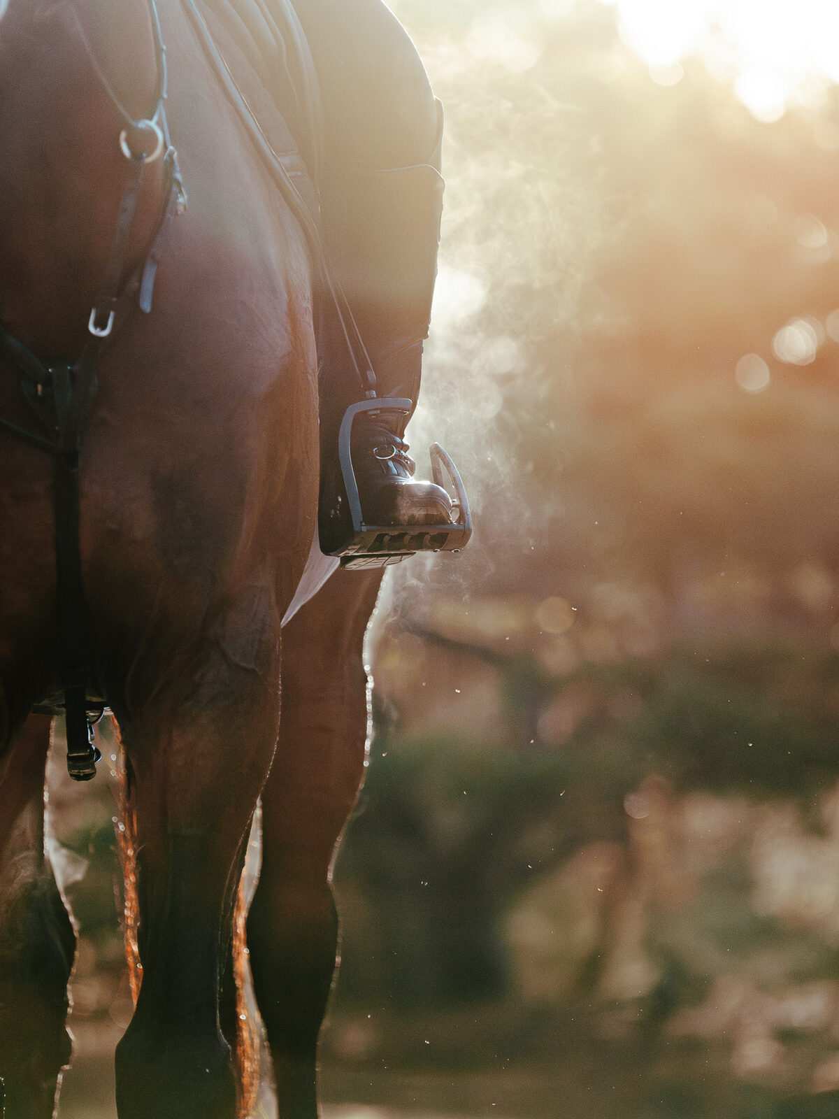
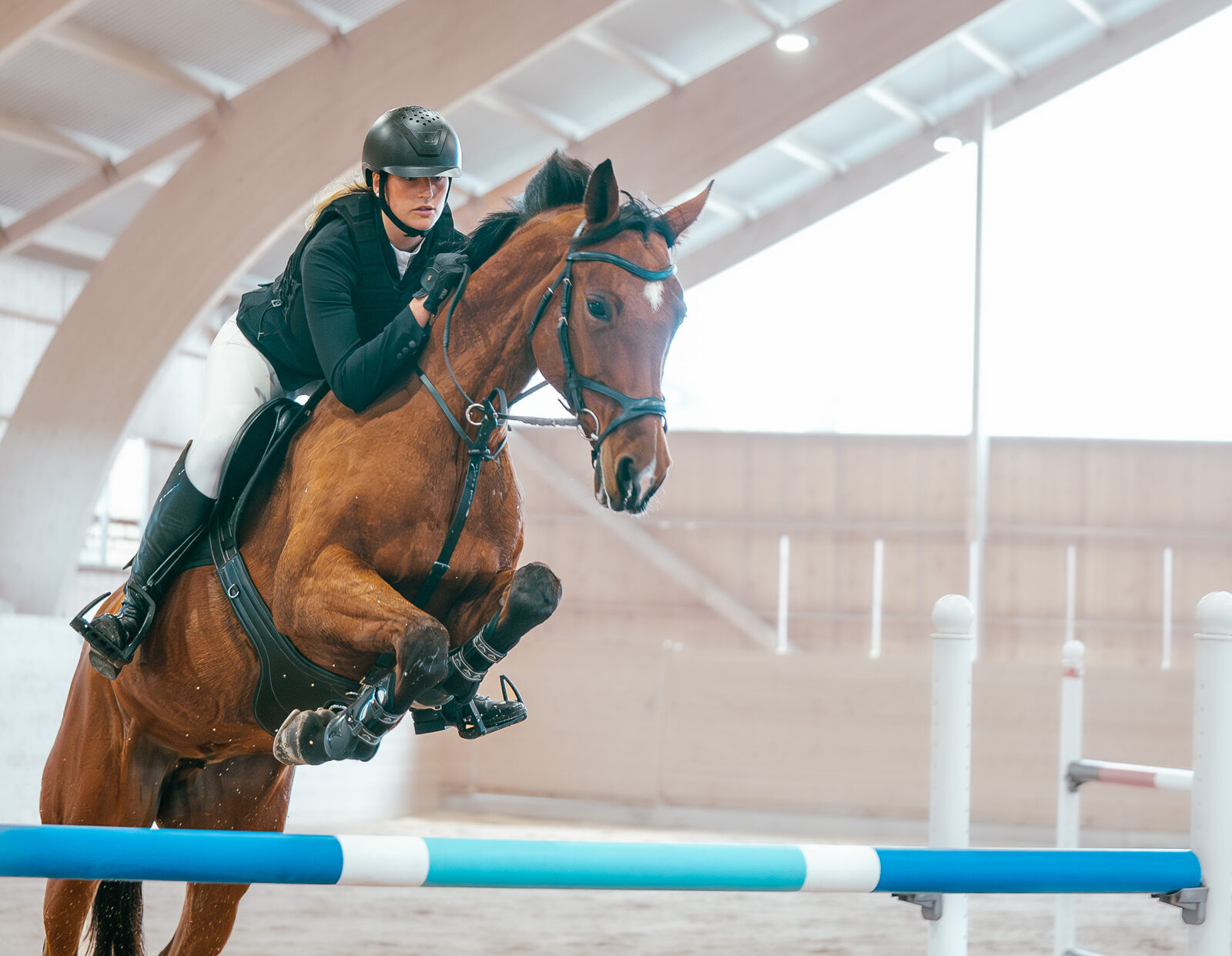
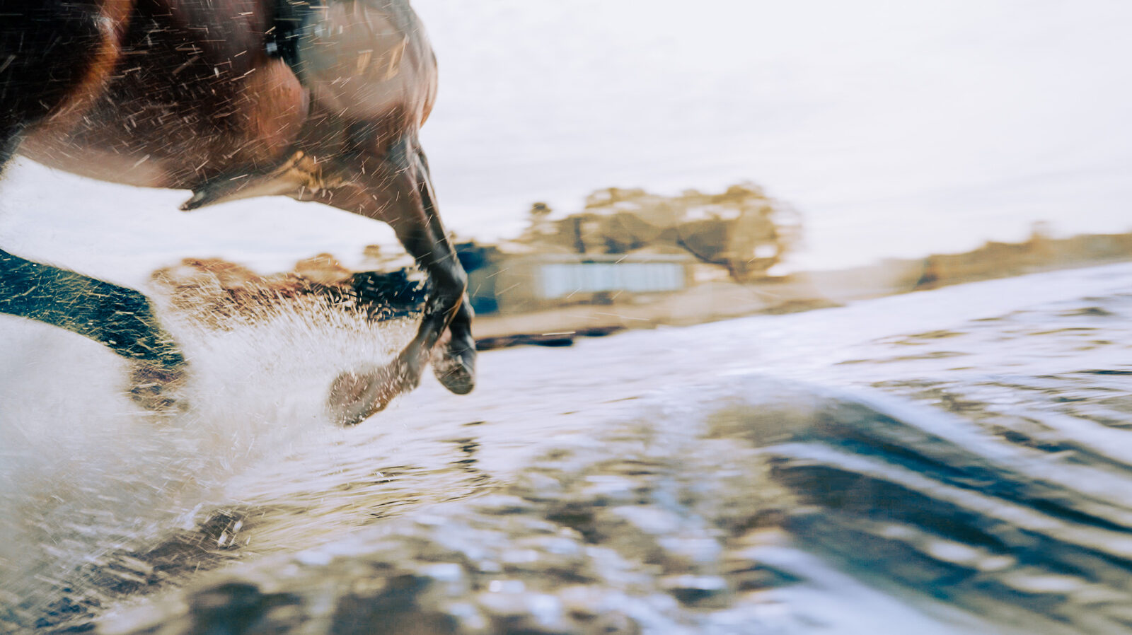
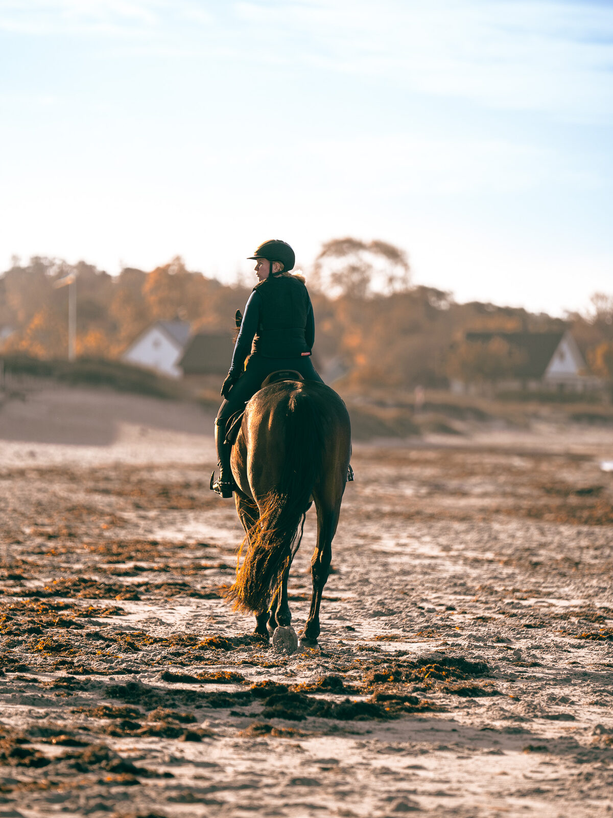
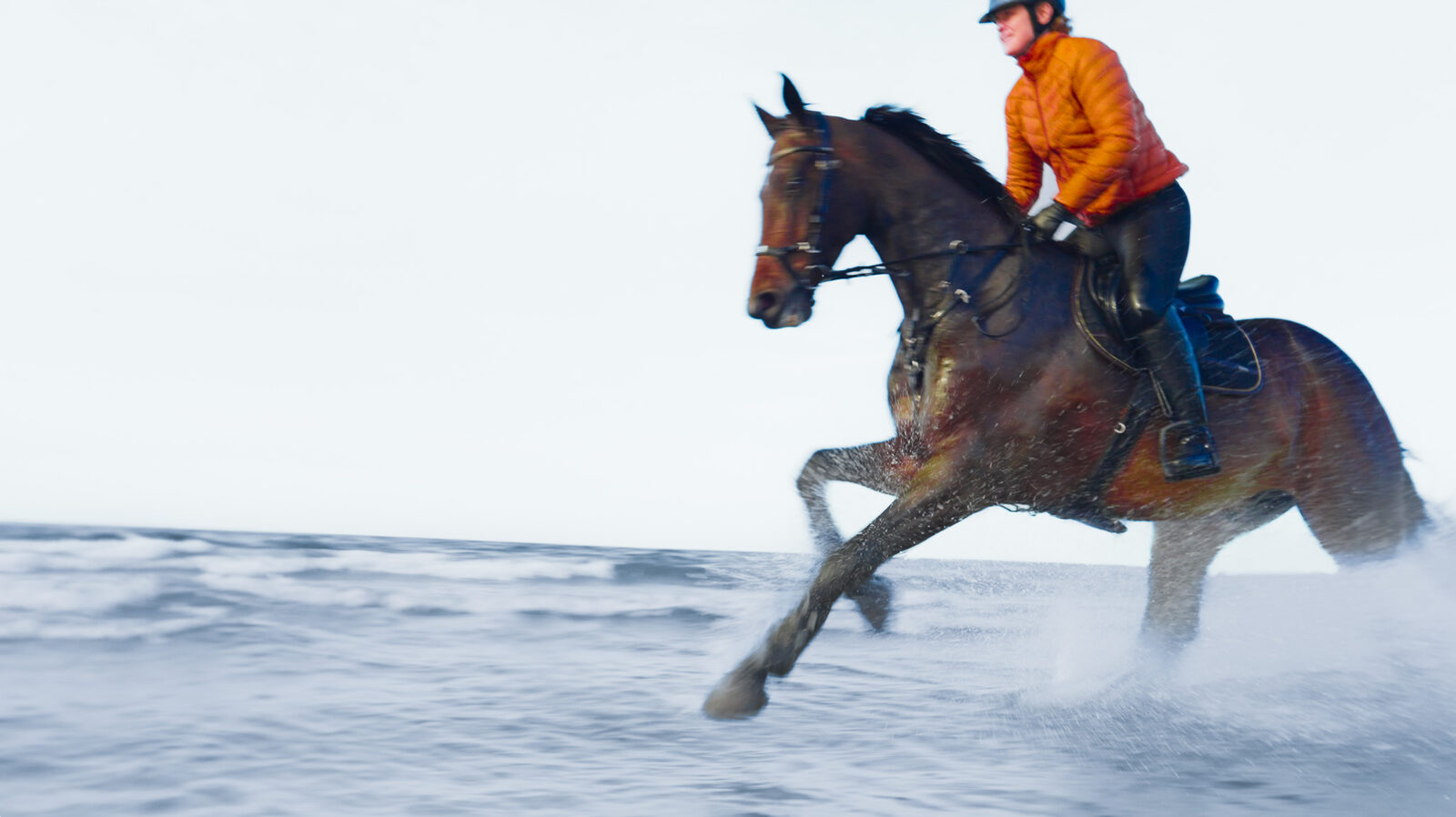
Visual tone of voice. Images and video that went into the brand guidelines
We shot the feeling material outdoors and moving, and kept text and graphics off it almost entirely, leaving imagery and music to do the work. That half is the brand film and the Gotland photography.
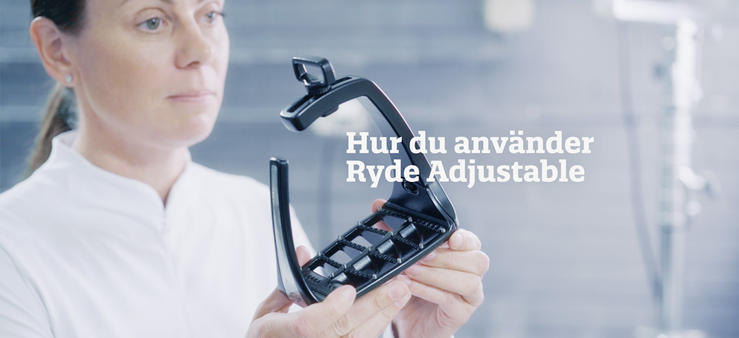
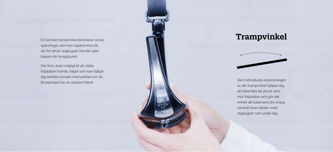
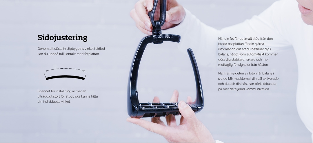
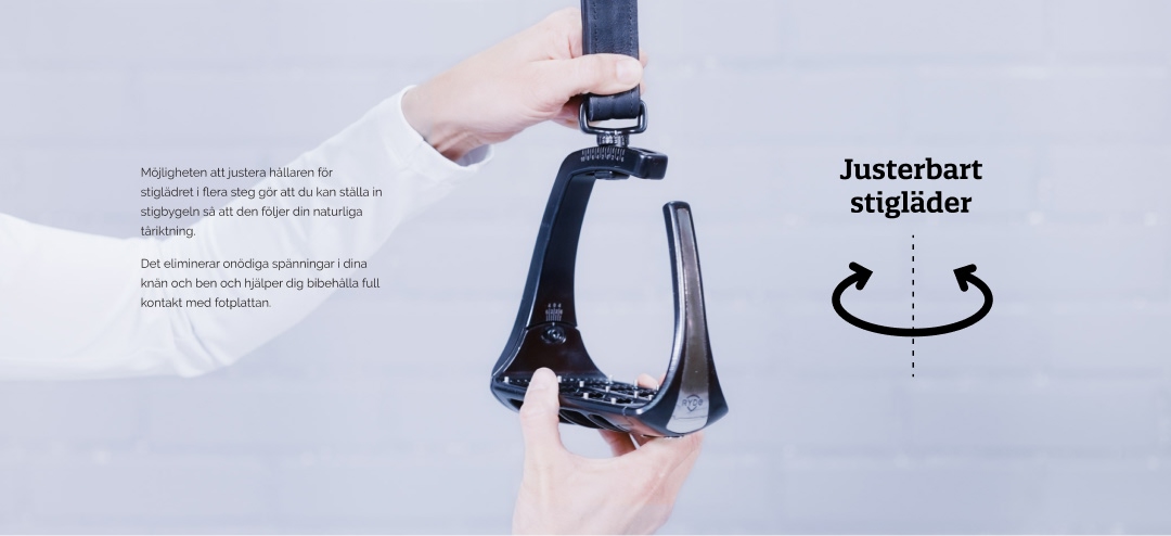
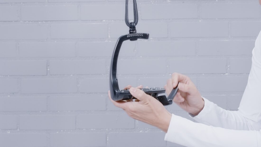
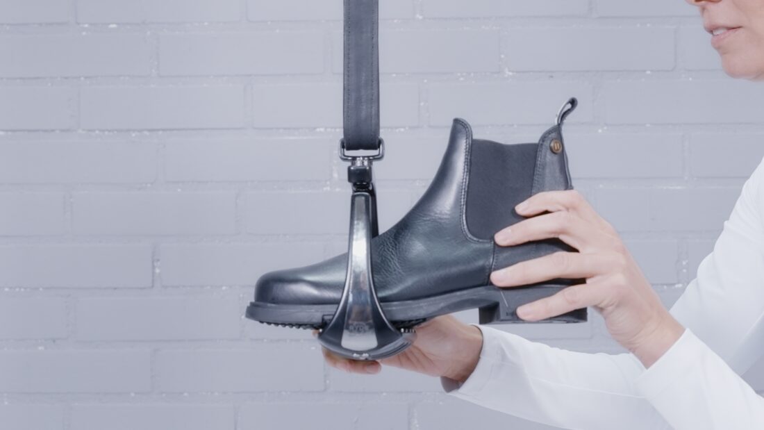
We shot the logic material in a studio outside Norrköping against white and pale blue walls, with Sanna dressed in white showing what each adjustment does, and built the fact based material for the site from it. That half carries the diagrams, the illustrations and the explainers.
What followed
18 months of whittling the final brand
On Gotland we started the brand, but it was just a scratch on the surface
What followed was a year and a half of tuning: more shoots, interviews with riders, and — the part that mattered most — a founding team getting steadily clearer about what they had actually built.
That last one is easy to underrate. Founders deep in a product often cannot say plainly why it is good, because every part of it seems equally important to them. Watching them explain it to other people, over and over, is how the hierarchy appears.

The three sites
Where the platform became visible
The platform showed up in three builds, each made for how far the company had actually got.
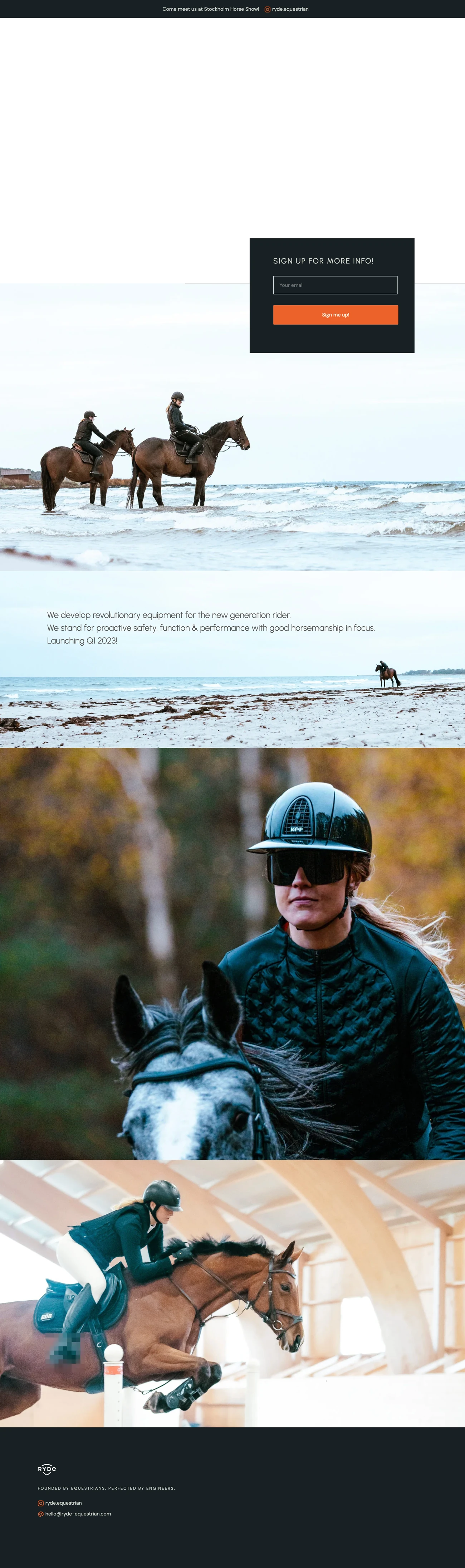
The teaser
Nothing to sell — the stirrup was not in production and had no price, so a shop would have been a promise Ryde could not keep. One page, the Gotland material, an email capture, live for Stockholm International Horse Show.

The pre-order
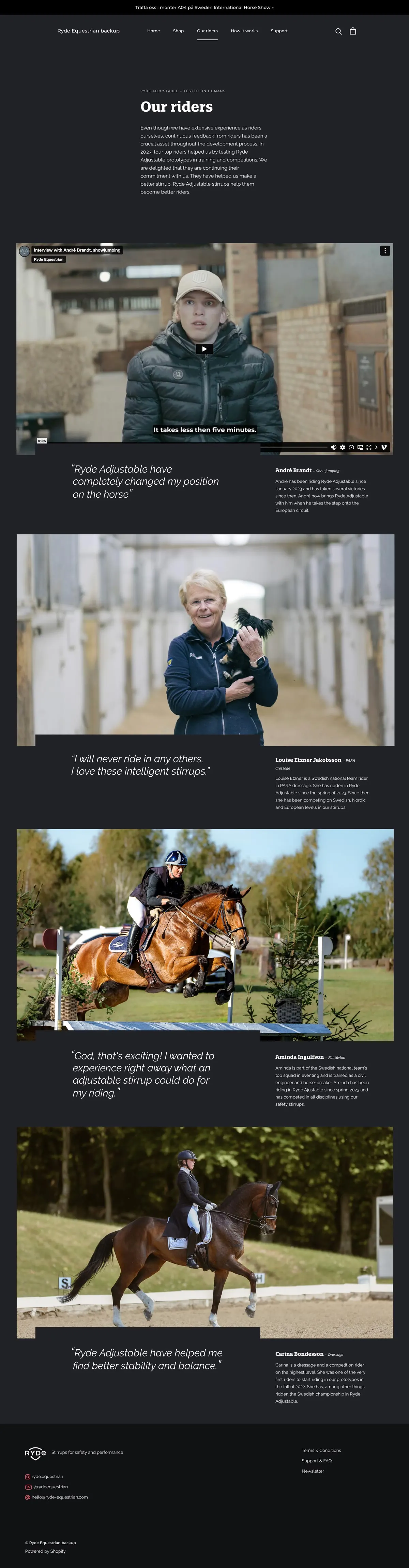
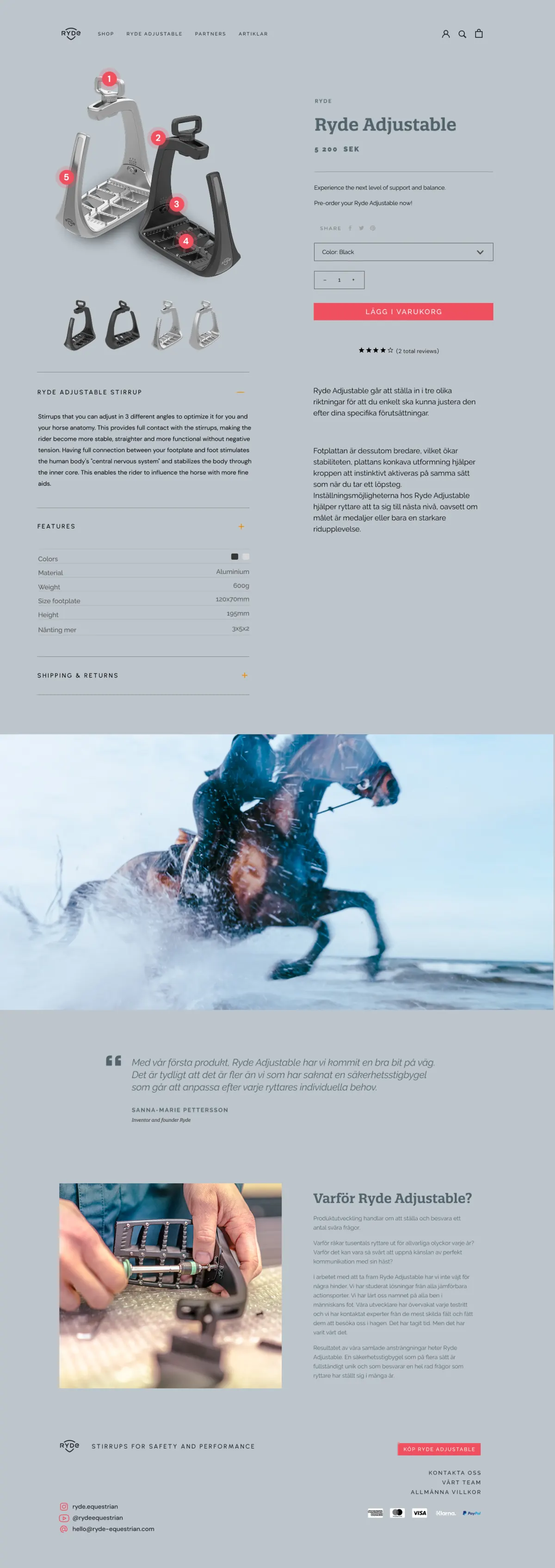
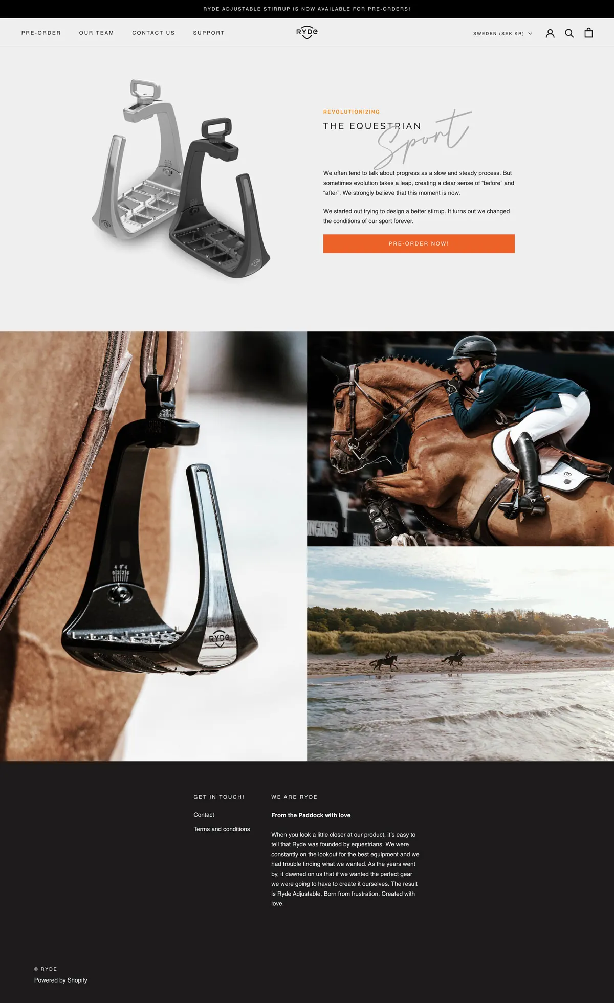
Six weeks, eleven steps: content and product skeletons, then markets, shipping zones, payments and a Fortnox integration. Shopify, because a four-person company should not be maintaining its own checkout. I built the theme — Prestige as the base, then Liquid, so it behaved like Ryde rather than like a theme demo. Three design rounds, and across them you can watch the platform arrive: the first round is loud and still guessing, the shipped version is quiet and certain.
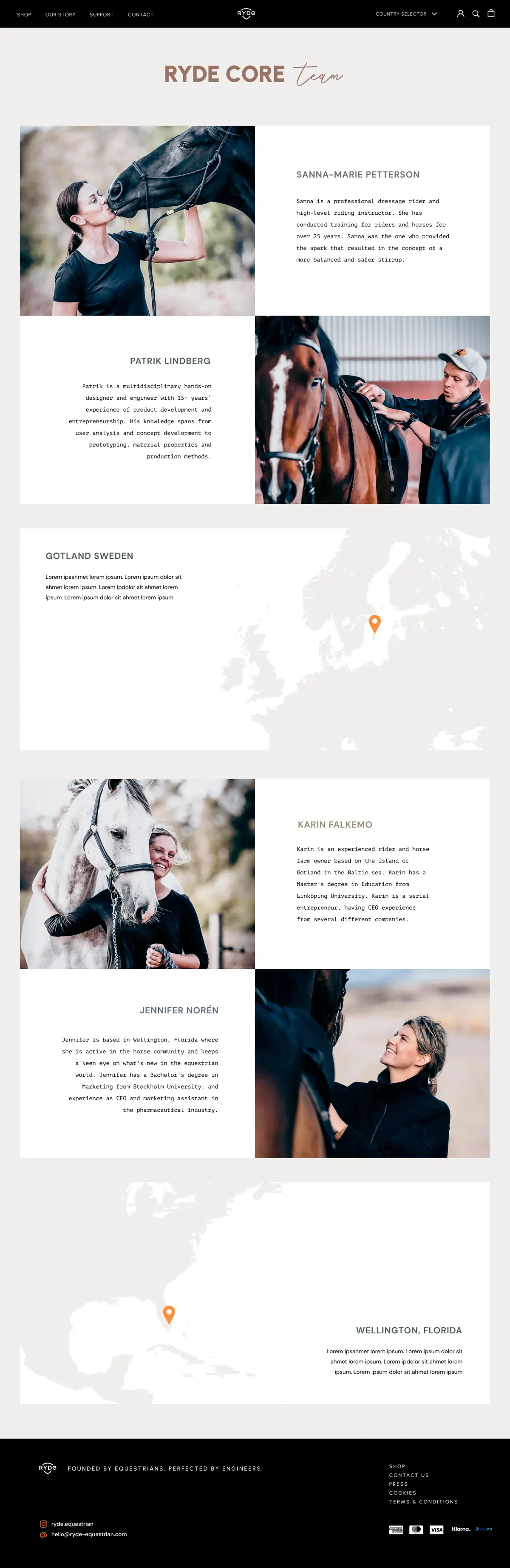
The full site
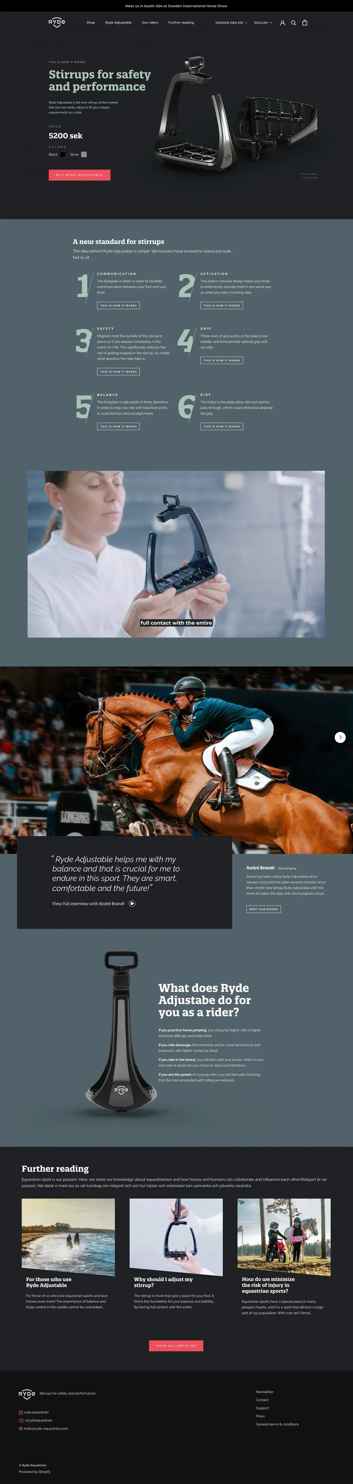
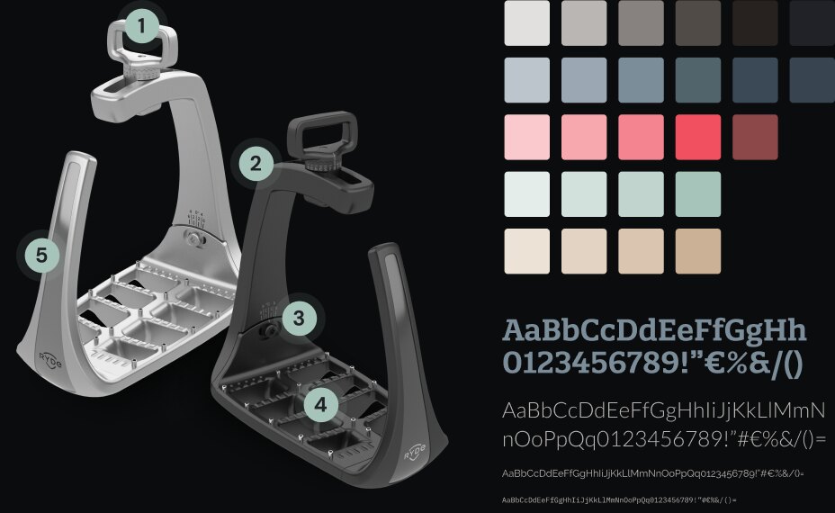
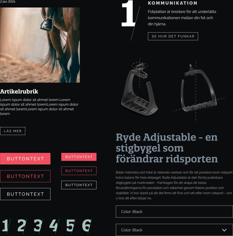
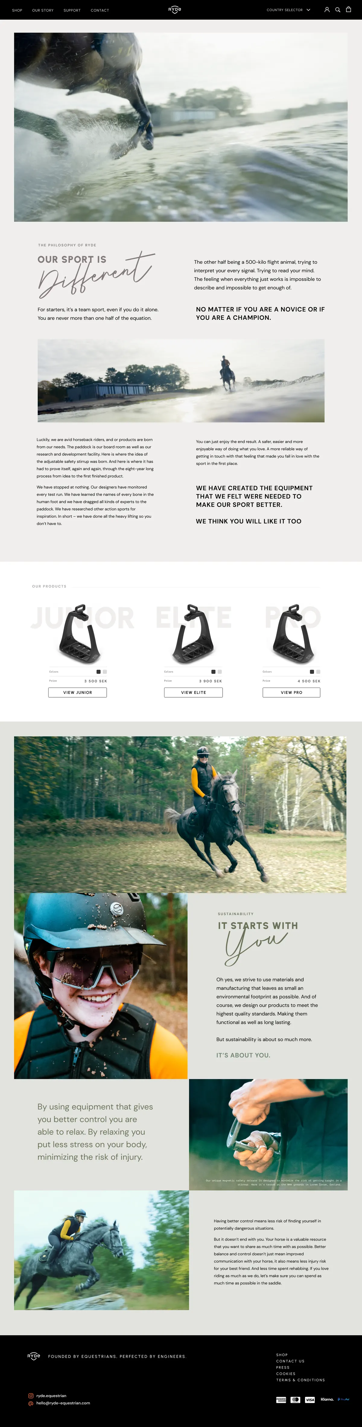
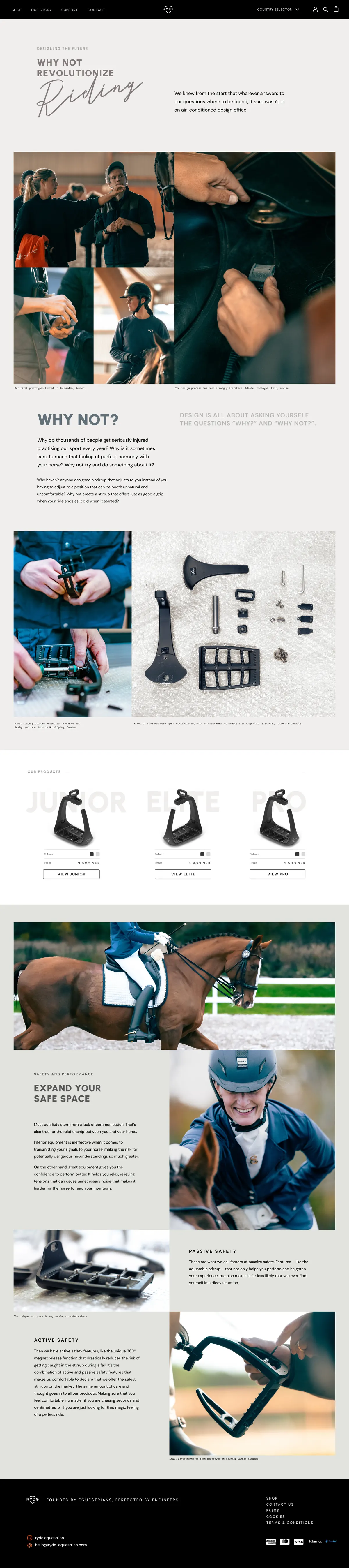
Pale sage and dusty blue, Neue Montreal, editorial cards over full-bleed action photography, and the four things the stirrup does as a plain numbered list. The two sides finally in the same room: the photography carries the feeling, the numbered list and the function films carry the engineering.