Background
Sparsit, a Swedish AI startup founded in Norrköping needed a complete brand identity to communicate their sophisticated sparse visual modeling technology to both technical and business audiences.
Concept
The main challenge was communication. Sparsit's technology, sparse visual modeling and foveated rendering, is complex and abstract. The brand had to make that feel approachable to non-technical audiences while still earning respect from the technical ones. It also needed to scale from a favicon to a conference stage presentation.
Most AI companies default to the same visual language: gradients, neural network graphics, dark futuristic interfaces. I wanted to go the other way. Instead of chasing sci-fi aesthetics I looked backwards, at early computer terminals, 1960s tech interfaces and raster graphics. Graphically simple, two-dimensional and retro.
That became the “Retro future” concept: raster, sampling and simplification. These are actually the core principles behind Sparsit's technology, so the visual language wasn't just a stylistic choice. It was a direct reference to how their algorithms work. An authentic connection between what the brand looks like and what the company actually does.
Visual hook
Playful technology
The technology and algorithms behind Sparsit products are very abstract and complex I knew we had to come up something really simple that could catch the visitors attention and keep them on the site for just a little bit longer.
The visual hook
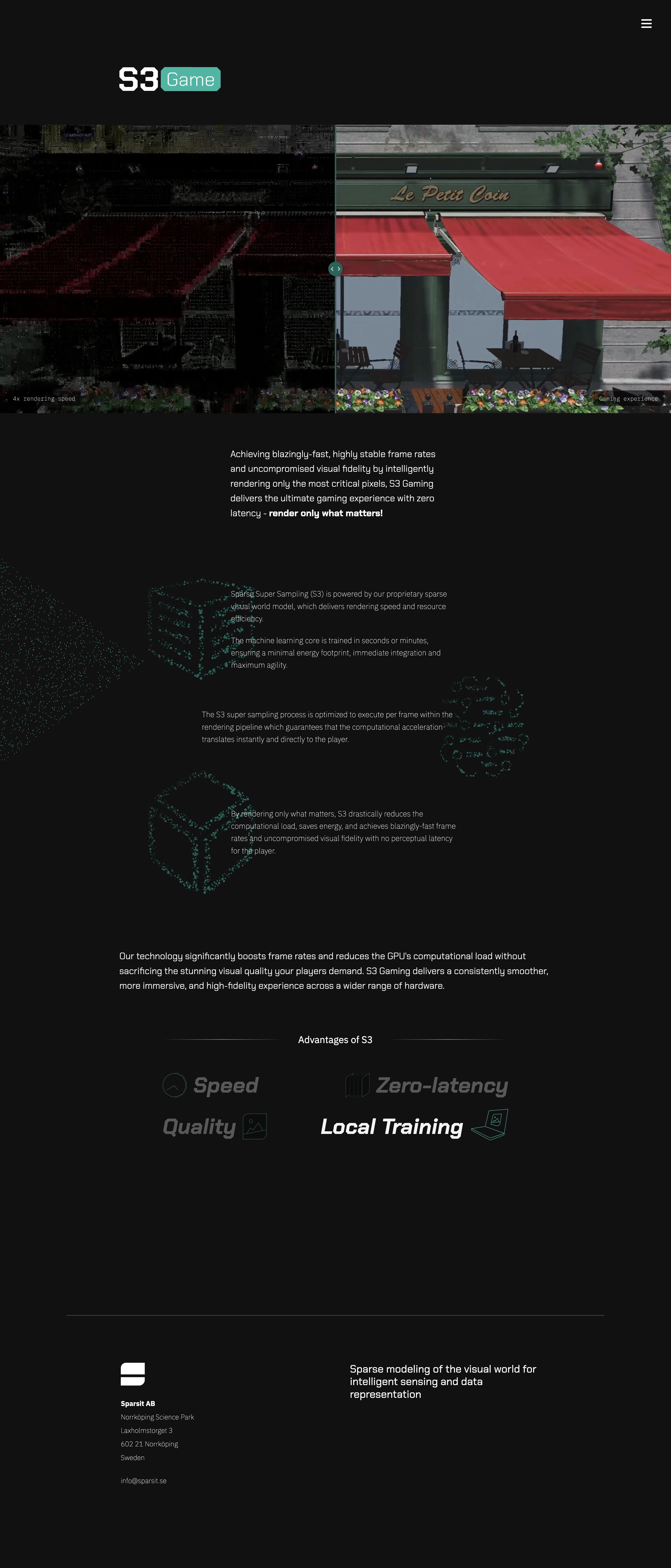
The visual hook came in form of a javascript based "see through" feature where the visitor could move their mouse/cursor over a videoclip showing Sparsit’s compressed version of a video. The cursor clipped a hole in the video and showed a re-constructed version through the hole.
The brand
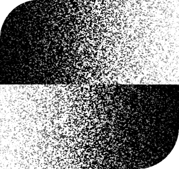
Started with the natural choice of "S" as the primary symbol. Experimented extensively with raster patterns and visual analogies for "sampling" to create a distinctive mark.
The breakthrough came with opposing gradients that abstractly form an "S" shape—directly referencing the gradient-based optimization central to their ML algorithms.


Final logotype
Developed two versions: a detailed gradient version for applications with space and prominence, and a highly stylized version for small formats like favicons and social media avatars.
Typography and colors
Selected typography and colors inspired by early terminal graphics, creating the right visual feeling without literal connection to their current technology stack.
Clean, technical typeface selection that works across both highly technical documentation and business presentations.
Chose Google Fonts for optimal web and print compatibility.
Colors
Minimal palette inspired by terminal graphics, with room for expansion as the brand evolves.
Product logos
Minimal palette inspired by terminal graphics, with room for expansion as the brand evolves.
Icons and animations
Whenever you visit the Nansen office you will meet Richardo Fuentes Bergström. He is the cosiest, friendliest and most loyal of all Nansen people.


