Creative team
| Andreas Carlsson | UX Lead and Creative Director |
| Sussi Zäll | UX research |
| Andreas Nymark | Visual design |
| Kristoffer Lybeck | Front-end |
| Sofia Karlsson | User testing |
| Jaan Orvet | Head of Creative |
| Charlotta Lorentz and David Kästel | Project Manager |
Target group
During the brand repositioning work Forsman & Bodenfors had identified the target segment as “The big city consumer”.
- 30–50 year old
- Lives in Stockholms inner city or north of Stockholm.
- Owns a home valued at 4 Msek+
- Has an income above the average; ca 1.000.000 sek/year.
- Experienced home seller (have often sold 5 homes or more)
- Are happy to move to a new home.
- Well educated, above average Swede.
Together we started building out the new brand from that.
We started our research phase by tapping in to three sources of data:
Research material
User interviews
Leading up to the project 5 deep interviews had been made, focus groups and an online attitude study with 1001 respondents had been made.
Key outcome from the user interviews
Fastighetsbyran were considered cluttered, quite boring and didn’t stand out compared to other real estate companies. When asking the target group most of them answered that Fastighetsbyrån felt cheap, budget and wasn’t an option for them. They choose their realtor based on gut feeling and personality. The property presentation acts as an evidence on how you will be treated as a seller, if you sell an expensive object, then the presentation has to be exclusive. Google analytics
Fastighetsbyrån has a lot of experience working with GA, so gathering the data was easy for us.
The data showed that visitors used:
Propertypage + sök = 92 % Startpage 2 % Local agency 2 % Byt an apartment/house 1 % Features (cost calculators etc) 0,9 % Sell an apartment/house 0,6 % The rest: 1,5% 75% of the visitors came from Hemnet.se
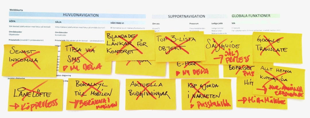
Feature inventory
All sections and functions on the previous site was evaluated based on the new target group and interviews.
Brand repositioning
As a base for the repositioning of Fastighetsbyrån Forsman & Bodenfors and Reagera hade made a two year pre-study which we used for our work.
Insights
When conducting our research and also going through the brand repositioning material it was clear that there were two, broad, user types: the seller and the buyer. We started digging deeper into their needs and how to create a better Fastighetsbyrån.se
User types
“The seller”
Enters the site via the start page, jumps back and fourth between Startpage ↔ Sell property ↔ Offices.
The conversion rate for sellers are 4,37%
“The buyer”
This is the “lazy surfer” that comes and goes between Hemnet.se and a property-page on Fastighetsnbyrån.se.
The conversion rate for the byier are 1,38%.

Based on the insights above it was clear that the start page had to focus exclusively on the seller. We had to get them to consider Fastighetsbyrån as an realtor and also to get them to contact a local office.
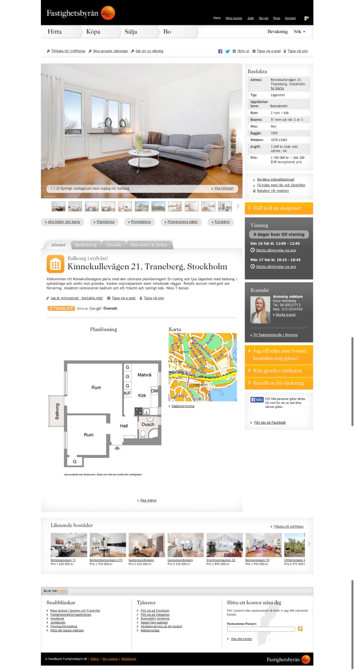
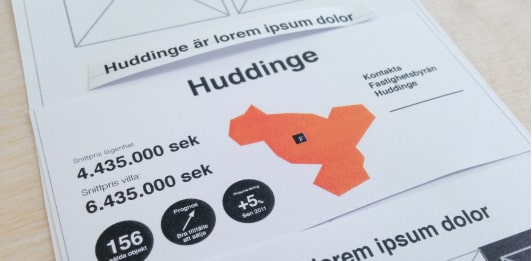
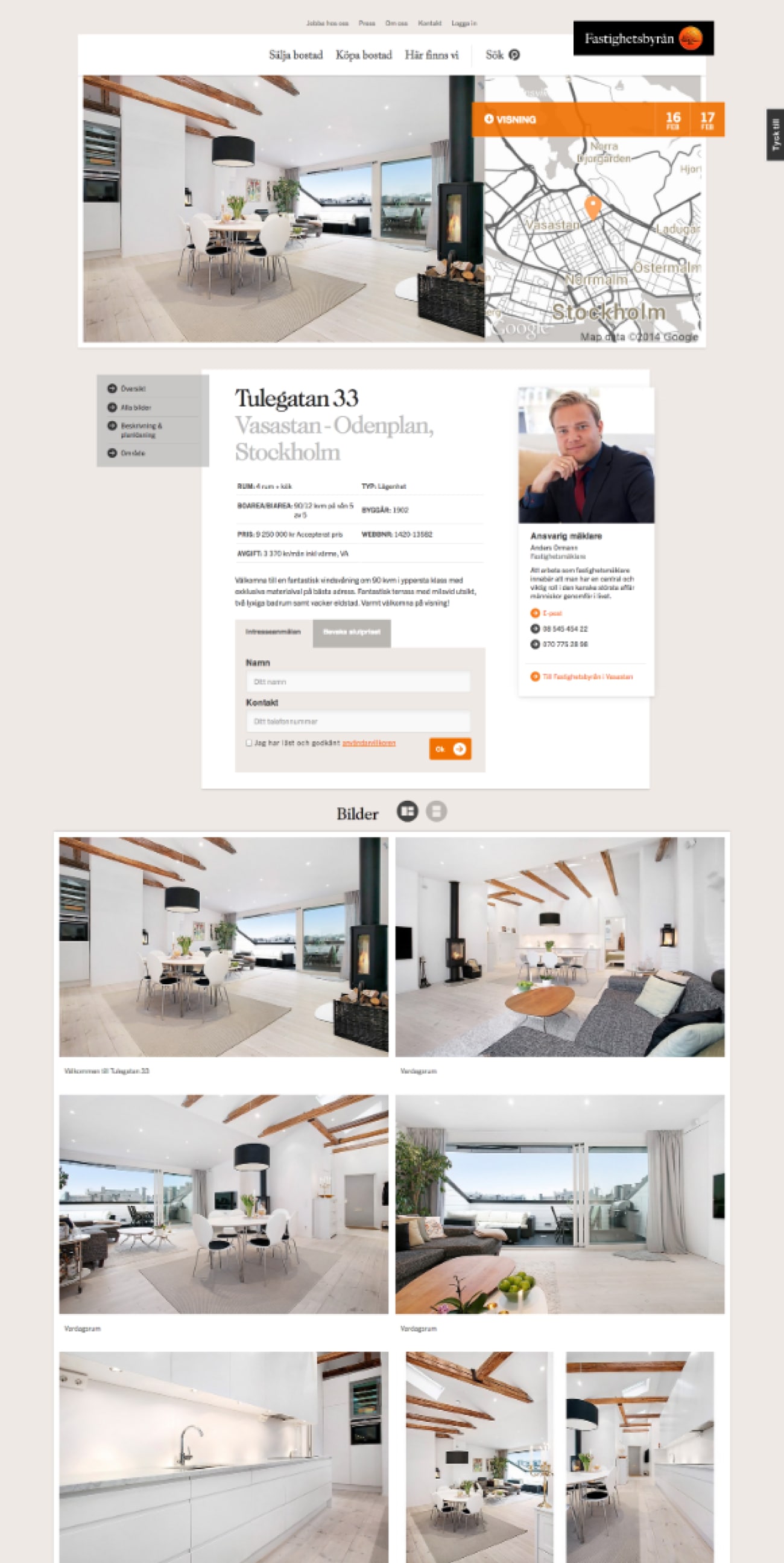
The property-page had to be redesigned to be clearer and cater for more high end objects and the needs of the "big city consumer"
Collaborative wireframing
Now that we know the user journeys of the site and what functionality needed to be on the site we choose to do a collaborative wireframing together with the client.
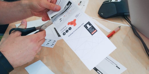
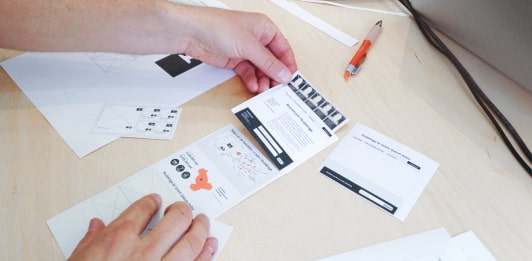
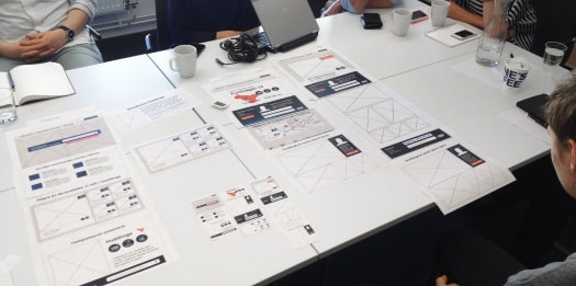
When the cut-out wireframes was done we took them back to the UX team and finalised them in a clickable prototype for user testing.


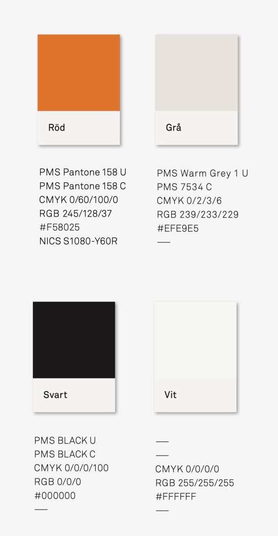
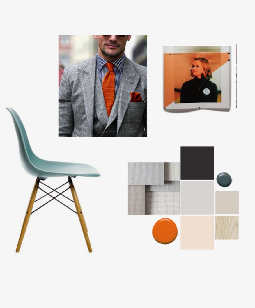
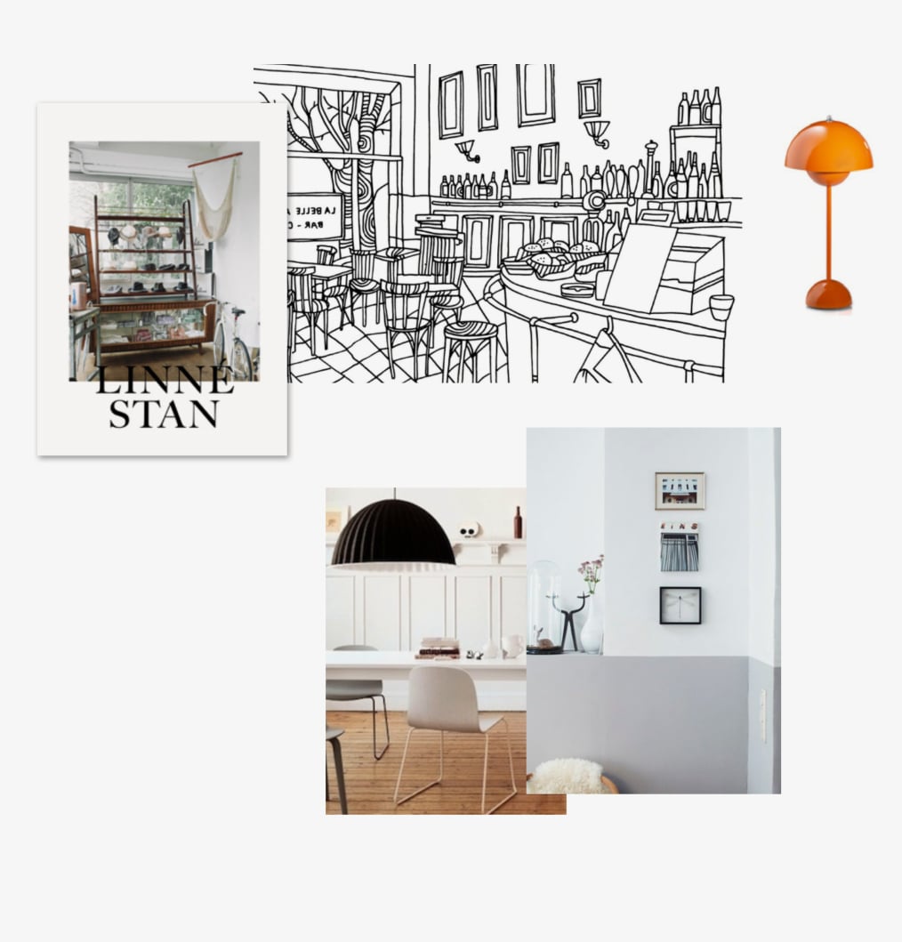
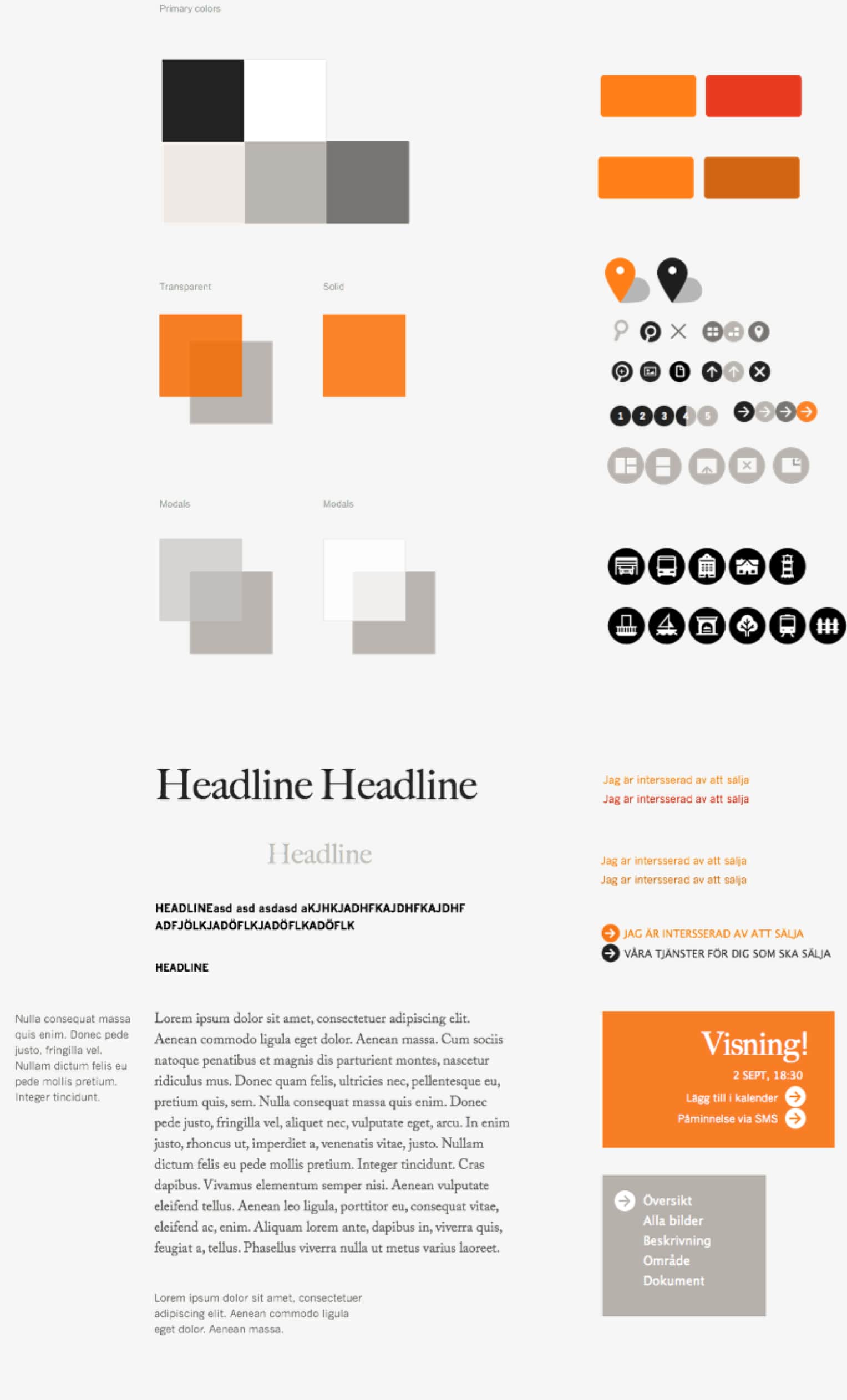
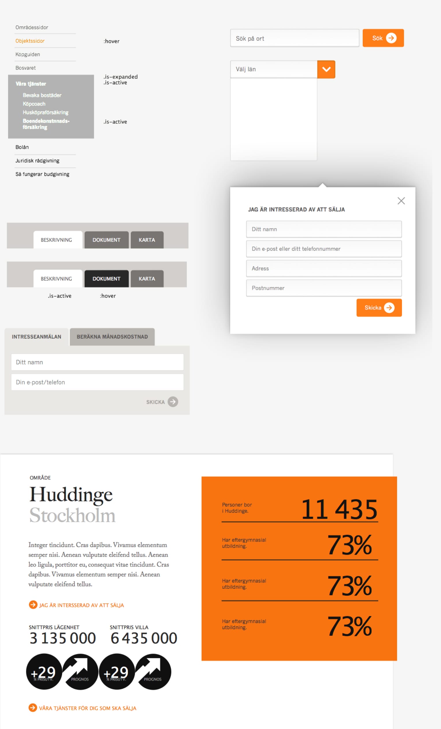
Building the design system
Starting off from Forsman & Bodenfors mood boards and suggested brand concept me and visual designer Andreas Nymark build out a design system with all the components we needed for the new online presence.
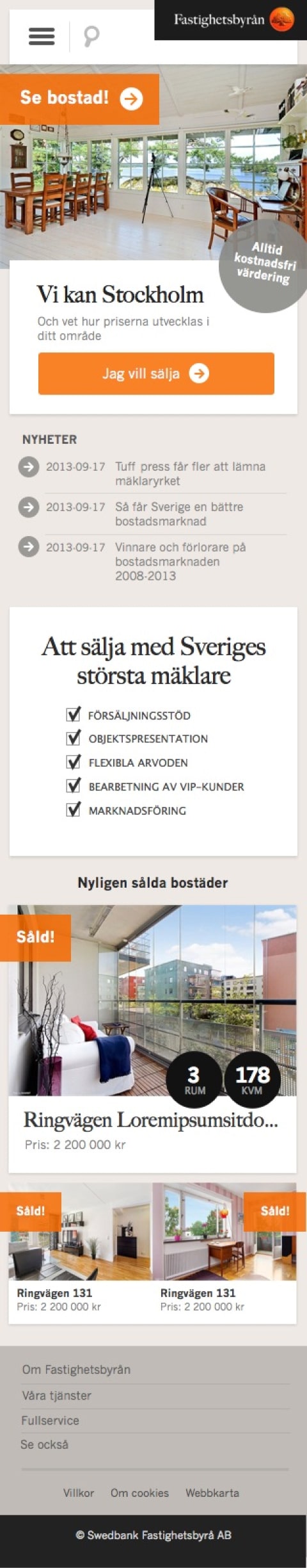
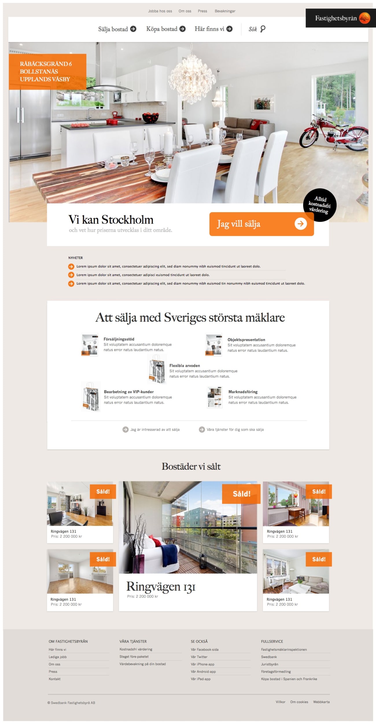
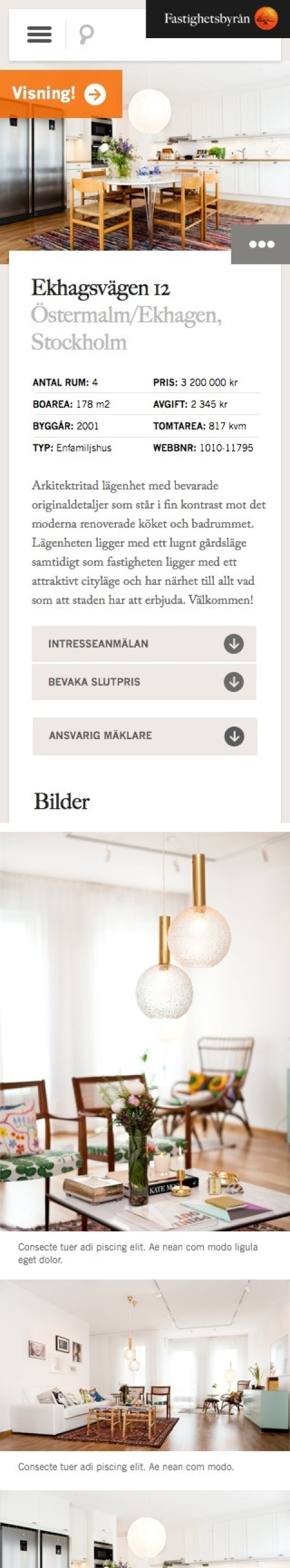
Final product
Here are a few examples of the solutions designed for the main user needs
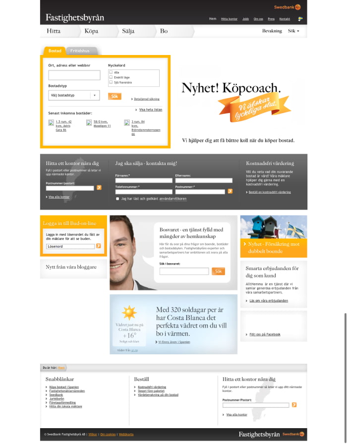
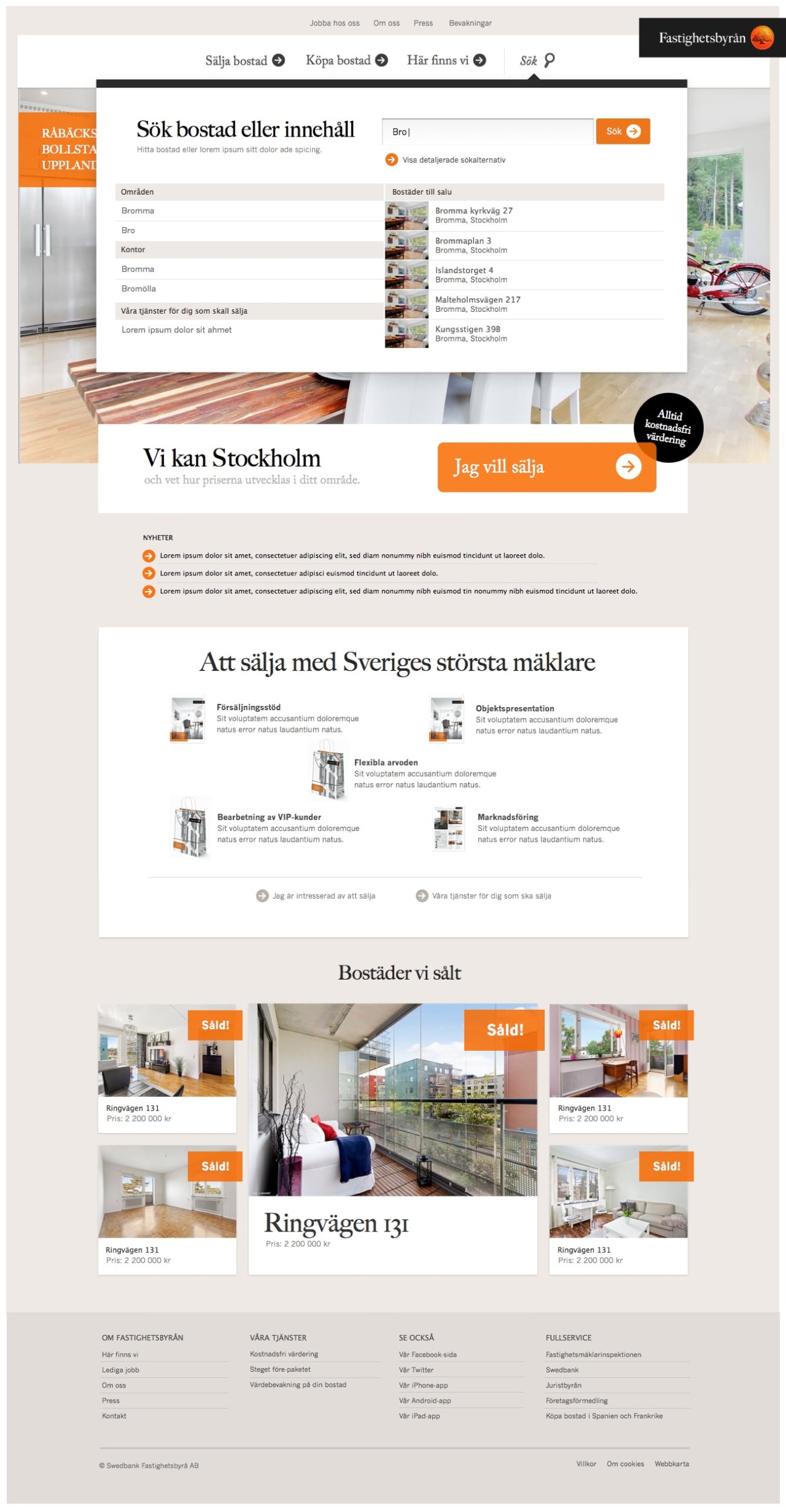
Start page focused on the seller
Detailed property page
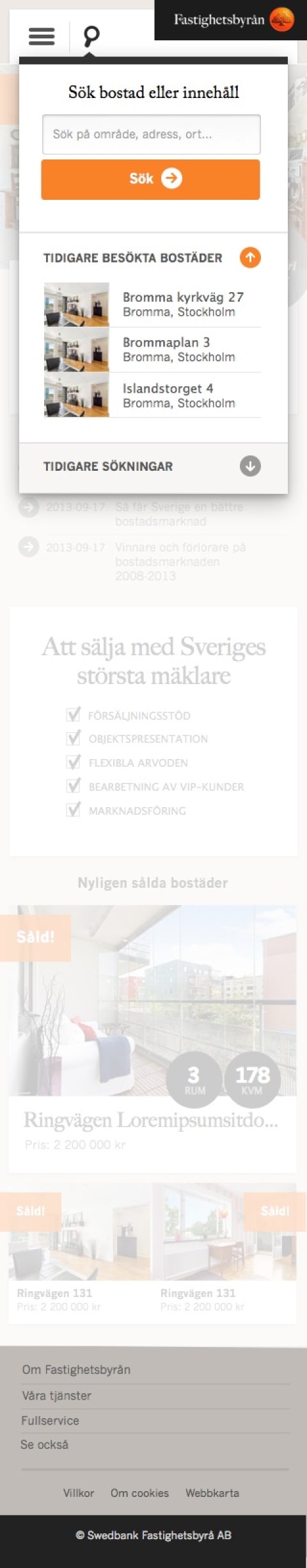
Improved and segmented search
Before