
Background
Network for Good is a nonprofit organization on a mission to unleash generosity. Since 2001, they've delivered over $5 billion to 400,000+ charities through innovative programs and strategic partnerships with companies like Walmart, Google, and Patagonia.
In 2013, they spun out a for-profit organization with the same name. After 11 years of shared identity, the for-profit was acquired by Bonterra, leaving the nonprofit without rights to their own name and brand. They needed a complete rebrand by April 2025.
Creative team
| Andreas Carlsson | Art Director and Webflow development |
| Melissa Martin | Chief Operating Officer |
| Camille Galles | Web content – Quintet Creative |
| Erika Glenny | Web content – Quintet Creative |
| Abby Ross | Chief Executive Officer |
| Whitney Kim | Product Manager, Platform |
| Eryan Cobham | Head of Engineering |
Goals & Objectives
Primary Goals
- Maintain brand recognition and legacy in the market
- Create a flexible brand system that could extend across various product lines
- Build from their successful 2022 rebrand rather than starting from scratch
- Establish clear market differentiation from the for-profit entity
Success Metrics
- Seamless transition without loss of donor confidence
- Scalable brand system for future products
- Preserved brand equity from previous identity
The concept
Vessels of Joy
I started with rough sketches exploring a droplet shape from the "f" in their their existing typeface. The roundness and softness of their brand font inspired circular, leaf-, drop- and balloon-like forms.

After multiple iterations, the balloon concept emerged as both visually cohesive and conceptually perfect. Just as balloons are vessels of happiness at celebrations – not the center of attention but immediate signals that something positive is happening — Network for Good serves as the vessel for donations, enabling joy without being the focus. They don't seek the spotlight but enable positive impact to happen.
The balloon became the guiding metaphor for the brand work.


I'm really digging the direction... the lightness of it and the balloons standalone without the 'for good,' there's the imagery that comes to mind. Definitely resonates with happiness.Melissa Martin, For Good
The concept had a "go!" :-)
Brand Positioning Network for Good isn't the actual donor or the celebration itself, but the vessel that makes generosity possible—much like how balloons make celebrations more joyful.
Name Strategy "For Good" became the umbrella brand, honoring their legacy while creating flexibility for future expansion. The first product would be "DAF For Good" (Donor Advised Fund For Good).
The new brand
Logotype

Colors

Illustrations

Background patterns


The site
Instead of designing the full site we focused on the two most critical pages: the homepage and the "What We Do" page. These pages needed to work hard by converting partners while maintaining the warm, approachable feel of the brand.
Homepage
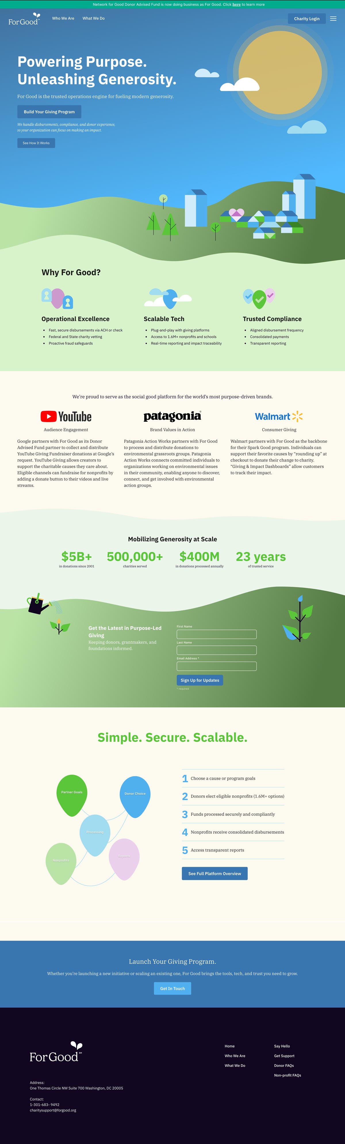
The homepage design extends the balloon metaphor from the rebrand into functional visual storytelling. Rather than using brand elements as decoration, they illustrate the actual results of For Good's platform—donations flowing from communities skyward.
The header features animated donation amounts rising from an illustrated cityscape, communicating that giving through For Good feels effortless and uplifting. Subtle animations bring life to the scene: clouds drift, the sun glows gently, and donations float upward. The movement creates dynamism without overwhelming.
Why For Good? section
Three columns with balloon-based icons reinforce trust and capability:
- Operational Excellence: Balloon with lock—illustrates security and reliable disbursements
- Scalable Tech: Balloon floating in clouds—visual metaphor for cloud services and plug-and-play integration (instead of the overused cloud icon)
- Trusted Compliance: Balloon with checkmark—symbolizes verification and regulatory compliance
Platform overview
Five connected balloons slowly float in space, each representing a step in the donation process. This animated visualization makes the donation flow tangible and engaging, breaking up the page tempo while keeping the brand's light, approachable feel.
The animations were developed collaboratively with Claude using JavaScript and SVGs—ensuring smooth, purposeful motion that enhances understanding rather than just adding visual flair.
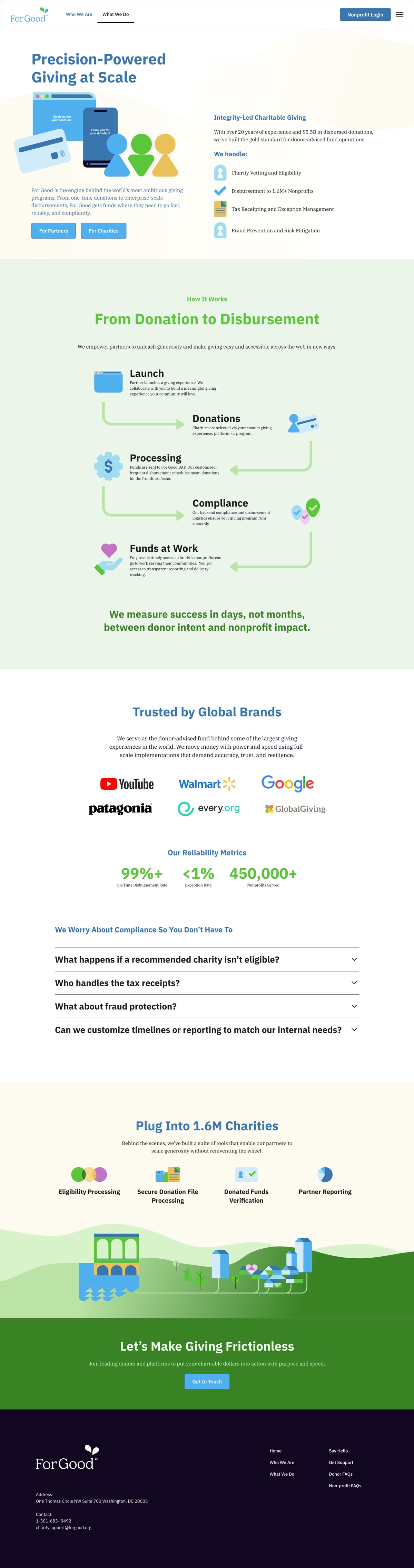
What We Do page
The "What We Do" page takes a more process-focused approach while maintaining visual warmth. Partners evaluating For Good need clarity and transparency—this page delivers both.
The design walks through the donation journey from launch to funds at work, using clean iconography and the brand's soft color palette. The layout balances informational density with breathing room, letting partners quickly grasp For Good's operational excellence.
Mini case studies for YouTube, Patagonia, and Walmart showcase real-world applications across partner types:
Impact metrics are presented horizontally with large, prominent numbers (500,000+ charities served, $5B+ in donations since 2001), reinforcing credibility and 23 years of trusted service.
The balloon visual system continues here—particularly in the "Simple. Secure. Scalable." section—maintaining brand consistency while adapting to a B2B-focused narrative.
Brand guidelines
A brand guideline was delivered to the team at For Good with explanations, usage examples and do's and dont's


Results & Impact
The project was a successful transition into the future for For Good. It maintained brand equity while establishing clear market positioning separate from the for-profit entity.
I wanted to reach out directly and share the excitement from the team, myself, and the staff for the new website!!! It looks amazing and so excited to have visitors come to the refreshed and more informational website that we have going. Thank you thank you.
Please soak in the exciting and amazing responses from us, the staff, the Board, and the team on the launch of the new website. It is certainly a clearer and cleaner reflection of what we do, how we do it, and who the "Good Do'ers" are behind it all.